
%22%20transform%3D%22translate(.7%20.7)%20scale(1.3125)%22%20fill-opacity%3D%22.5%22%3E%3Cpath%20fill%3D%22%236a575e%22%20d%3D%22M282.1%20170.7l-53.6%206.6-16.6-136%2053.6-6.6z%22%2F%3E%3Cellipse%20fill%3D%22%23f6759f%22%20cx%3D%2265%22%20cy%3D%22156%22%20rx%3D%2266%22%20ry%3D%2236%22%2F%3E%3Cellipse%20fill%3D%22%23f1fbf7%22%20rx%3D%221%22%20ry%3D%221%22%20transform%3D%22rotate(-16.1%2075.3%20-409)%20scale(59.30007%20236.1584)%22%2F%3E%3Cellipse%20fill%3D%22%23fff%22%20cx%3D%22137%22%20rx%3D%2252%22%20ry%3D%2237%22%2F%3E%3C%2Fg%3E%3C%2Fsvg%3E)
Color theory plays a crucial role in the user interface (UI) design of iOS apps, affecting everything from user experience (UX) to brand identity. By understanding and employing the principles of color theory, designers at Apple meticulously select color palettes that not only reflect the company’s branding but also enhance usability and accessibility. Judicious use of color facilitates communication and provides visual continuity, enabling a coherent experience across various applications and platforms.
Apple’s UI design stands out for its consistent use of color to convey status and feedback, helping users understand information hierarchies and interactions within the app. For instance, the use of the color blue across iOS system-wide elements signifies interactivity and action, reinforcing users’ actions and decisions.
Designers and developers creating apps for Apple’s ecosystem must consider how color affects the design and overall experience, ensuring that their products align with Apple’s design ethos and meet the high expectations of users accustomed to the brand’s aesthetic.
Fundamentals of Color Theory
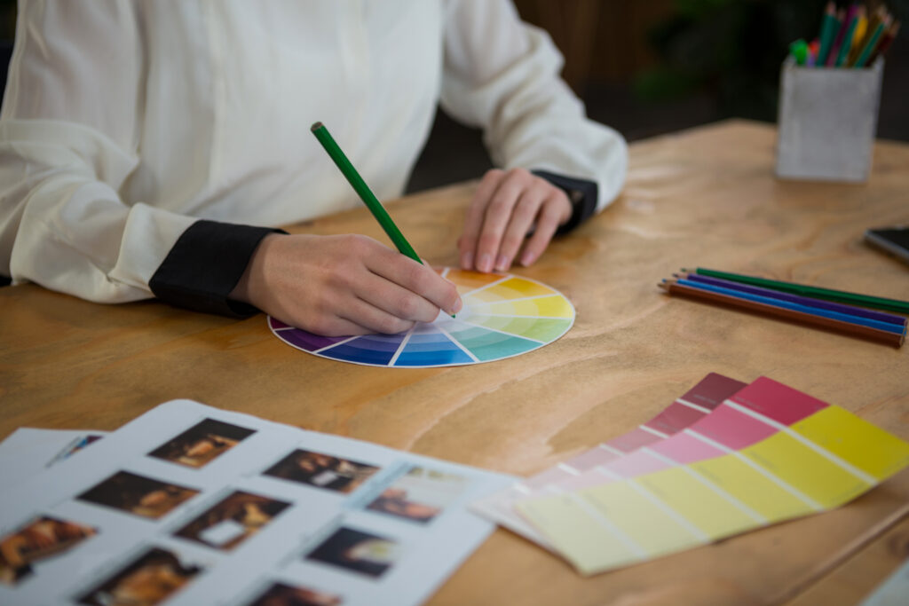
In the realm of UI design, a robust understanding of color theory is critical to the development of an appealing, functional product. The right use of colors can define an app’s identity, enhance user experience, and ensure accessibility.
Understanding Color in UI Design
When designing UIs for iOS apps, designers must grasp the importance of color spaces, like sRGB and Display P3, which Apple devices use extensively. Selecting the appropriate primary colors (red, blue, and yellow) is just the first step. From there, secondary (orange, green, purple) and tertiary colors arise based on the combinations of primary colors. Accent colors should be chosen to complement or draw attention within the app without jarring the user experience.
Color Psychology and Branding
Color psychology plays a pivotal role in user perception and branding. Apple’s branding, for example, utilizes greyscale with a hint of apple red to convey sophistication. Each color, whether used as a text or background color, is imbued with meaning: red suggests urgency or passion, blue promotes trust and stability, and green often represents eco-friendliness or financial services.
Accessibility and Readability
Apple’s Human Interface Guidelines emphasize the importance of making apps accessible to everyone, which includes being readable and legible. Contrast is key; for instance, if the text is light, the background should be sufficiently dark, and vice versa. Factors like text size, line height, and letter spacing contribute to the overall legibility of the app content against its color palette.
Color and Emotion
In UI design, the colors elicit specific emotions that can enhance the user’s interaction with the product. A blue color scheme might create a calm and secure feeling, while a vibrant yellow might invoke energy and alertness.
These emotional responses are vital for the user’s connection with the app, influencing both the user experience and the overall product success.
Implementing Color in Apple’s UI
Proper implementation of color in Apple’s UI enhances user experience by providing visual coherence, clear guidance, and intuitive feedback. Consistent use of color strengthens a brand’s identity and accessibility across various Apple platforms.
User Interface Elements
In Apple’s UI, color selection for user interface elements is paramount. Icons and images leverage color to maintain visual harmony on screen, often adhering to a layout defined by a grid system.
Background colors are chosen to minimize eye strain and provide a suitable canvas for typography and other components. Spacing and alignment within these UI elements contribute to a clean and organized appearance, vital for an engaging user experience.
Navigational Components
Navigational controls within Apple’s user interface rely on color to indicate interaction states and hierarchy. The status bar, tab bar, and home indicator often employ a color scheme that complements the overall design while facilitating user orientation.
Buttons and links are distinctly colored to signal actionability, with states such as hover and click highlighted through subtle color transitions. Consistent color use in these components simplifies navigation, enabling intuitive movement through the app’s layers and features.
Interaction and Feedback
For interaction and feedback, colors in Apple’s UI signify immediate responses to user actions. Controls exhibit different colors when selected or deselected to provide visual feedback.
During the interaction, animations, and transitions feature colors that support the logic and purpose of the action. Feedback is crucial, and colors are employed smartly to communicate success, warnings, or errors within the UI, as observed in progress indicators and confirmation messages. Such color cues are integral to a fluid and informative user experience.
Apple’s Design Tools and Technologies
Apple’s suite of design tools and technologies equips UX designers with the means to create intuitive and aesthetically pleasing interfaces across various Apple devices. These tools, along with Apple’s robust design guidelines, empower designers to create cohesive and user-friendly interfaces.
It might sound surprising, but this little tip on how to make MacBook screen stay on can significantly enhance the design workflow on these tools. This feature is especially useful during prolonged design sessions or when conducting user interface tests, as it ensures the screen remains active without manual intervention. This continuous screen activity is vital for real-time design collaboration and for maintaining focus during detailed design tasks.
Design Systems and Software
Apple’s design system is known for its thorough documentation and sophisticated software that assists designers in crafting coherent UIs. Designers often use software like Sketch and Figma to develop the layout and visual elements of iOS apps. Sketch provides vector editing and is tailored for interface design, while Figma offers real-time collaboration, allowing multiple designers to work on the same project simultaneously.
Developing prototypes is an essential part of the design process, and tools like ProtoPie allow designers to create complex interactions and test user experiences before they are built into a product.
Typographical choices and variations of text components are critical in Apple’s design system, ensuring legibility and aesthetic harmony across its product line, which includes the Mac, iPhone, iPad, and Apple TV.
Developing for Apple Devices
When it’s time to turn design concepts into functional applications, technologies such as Xcode come into play. It serves as the integrated development environment for creating apps for iOS, macOS, watchOS, and tvOS.
- Coding Languages: Xcode supports a variety of languages, including Swift—Apple’s robust and intuitive programming language favored for developing iOS 16 apps.
- Frameworks: Alongside language support, Xcode integrates with frameworks and APIs to interface with system-level components, like ARKit for augmented reality and HealthKit for health-related apps.
- Version Support & Testing: Developers utilize CMS and CAD tools within Xcode for version control and collaborative design. The live previews and interface builder help in laying out screens for different devices, and adjusting the UI elements as per device specifications.
By providing a comprehensive ecosystem of design and development tools, Apple ensures that designers and developers can create products with cohesive design languages and optimal user experiences across all Apple platforms.